
DUET HEALTH |
Project OverviewPatients forget roughly 80% of what they were told as soon as they leave the doctor’s office. By providing a place where patients can follow a designated treatment plan and providers can better understand patient habits and how they feel, they can actively improve their outcome.
|
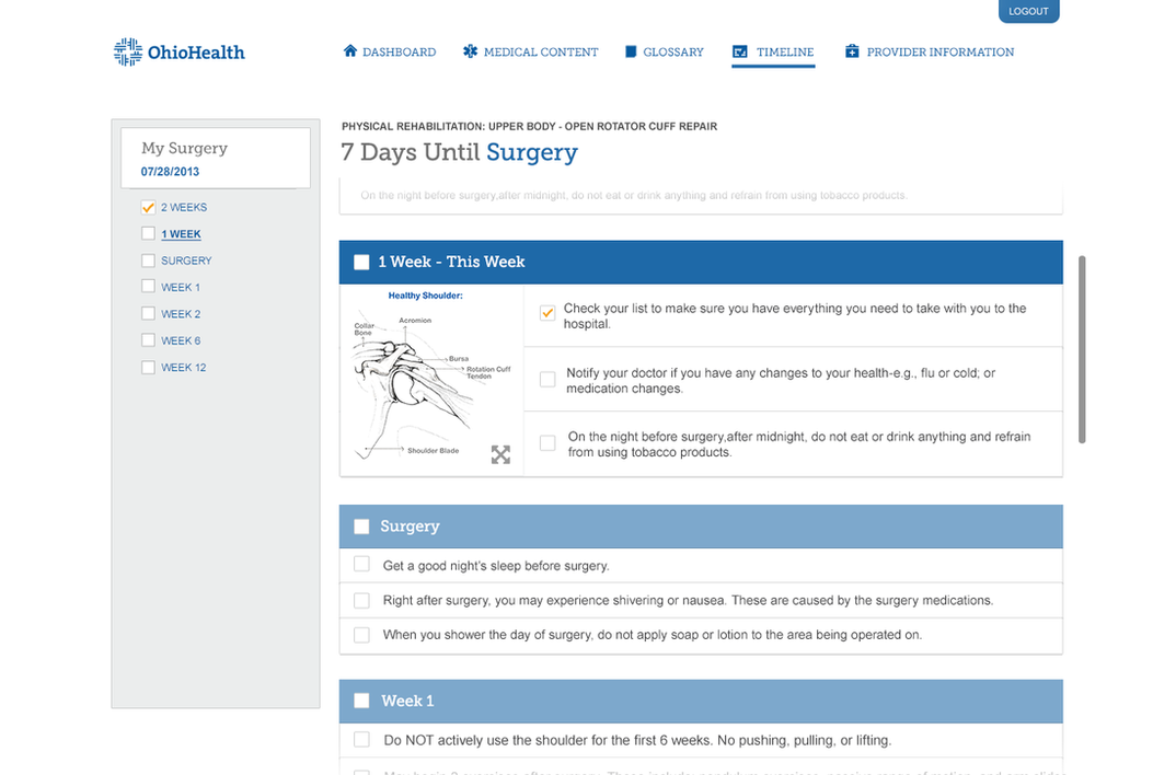
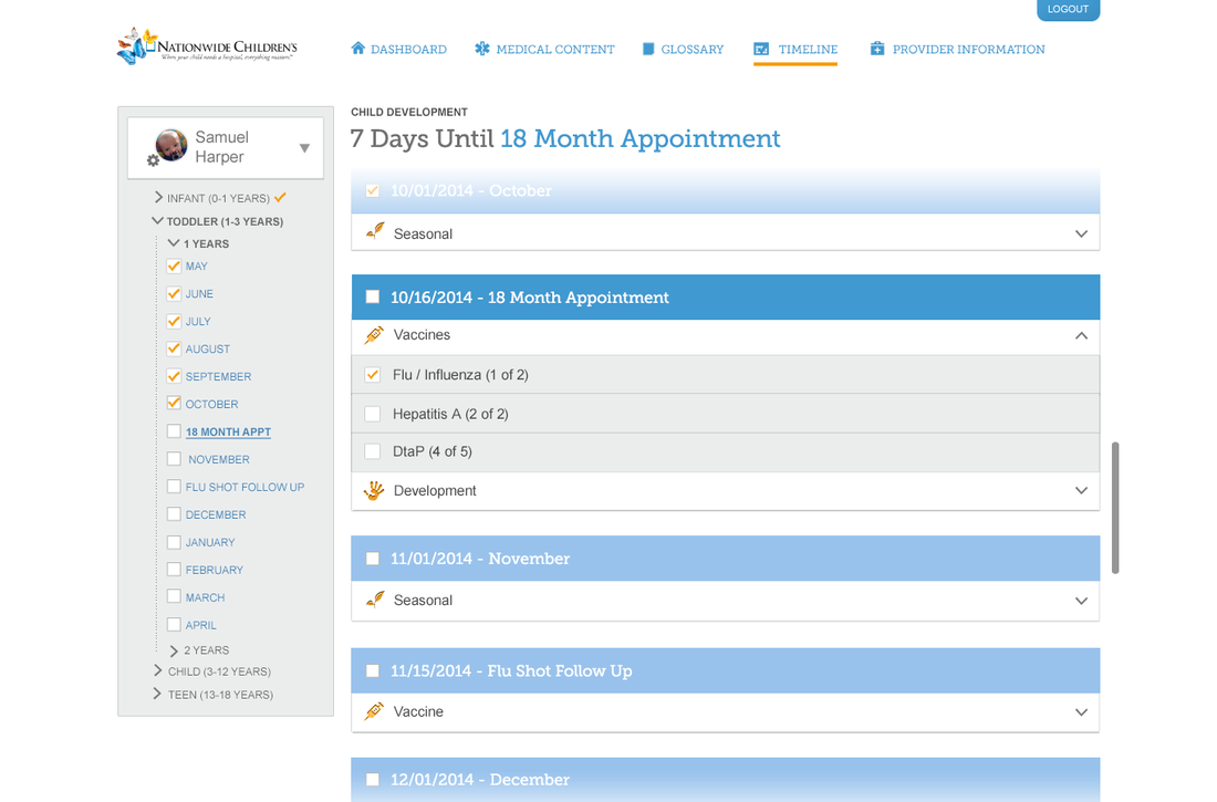
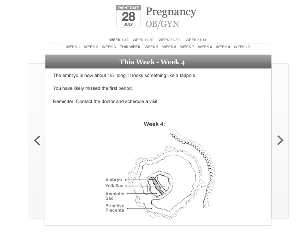
TimelineThe timeline provides relevant tasks at intervals to help patients stay on track whether preparing or recovering from a procedure, physical therapy, or getting your child vaccinated. The right column displays what the mobile app was known for: the patient's designated treatment plan including instruction, checklists, and rich media content. Completed activities can be checked off for each date and long term progress can be tracked on the left.
|
|
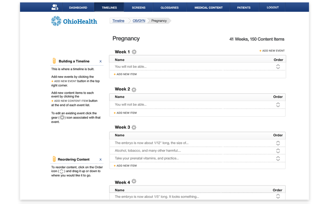
Because of extra real estate on the web, I created the left column functionality which provides more efficient access to the full breadth of treatment. So the user can quickly navigate back a long way, but also instantly know where they are currently and what’s next.
|
|
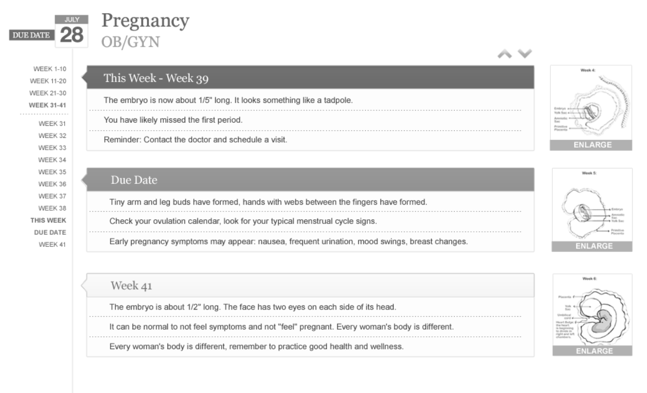
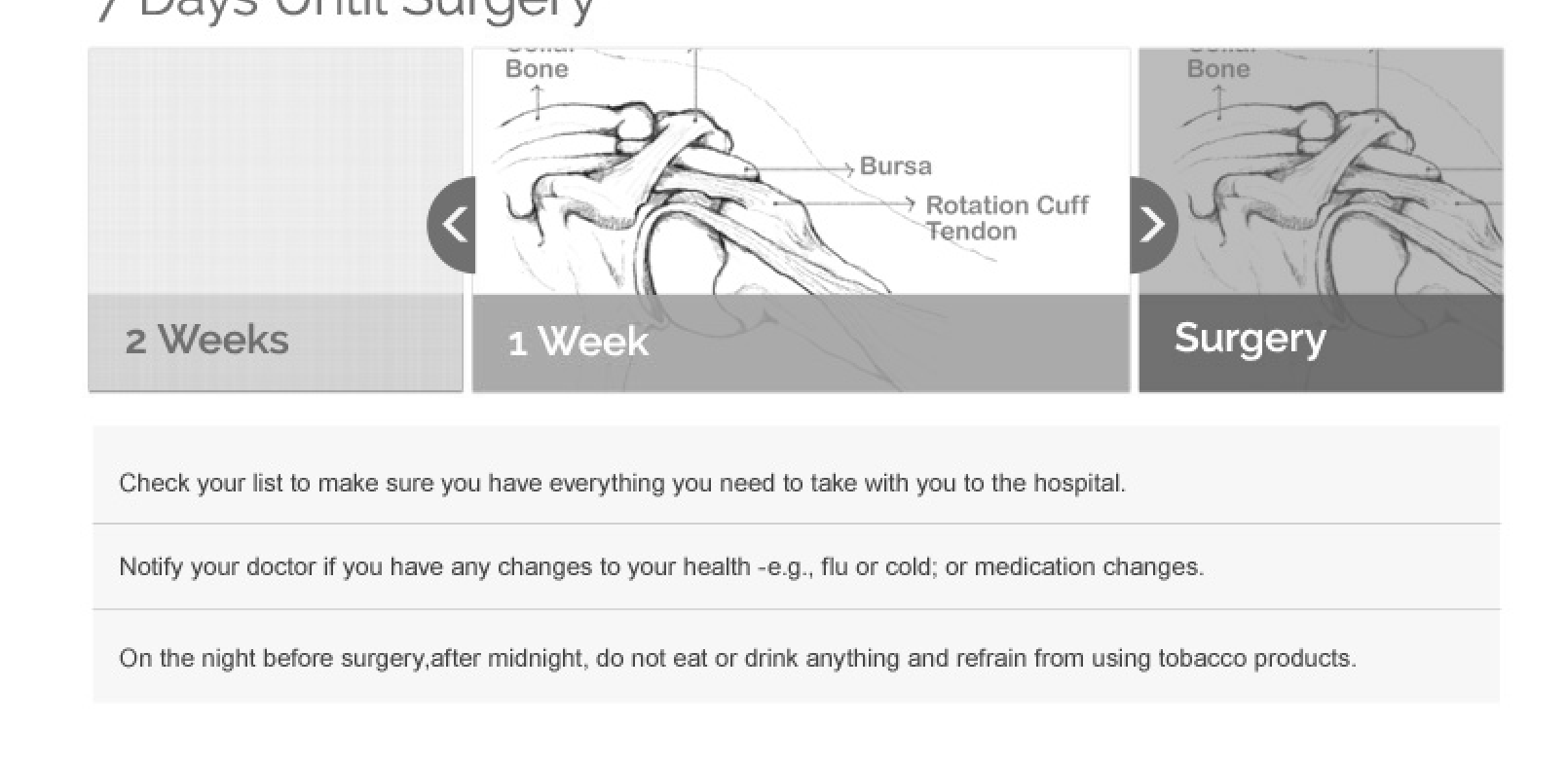
Below you can see a couple of alternative solutions I put together for the timeline to try to account for situations where images were included.
|
|
|
|
|
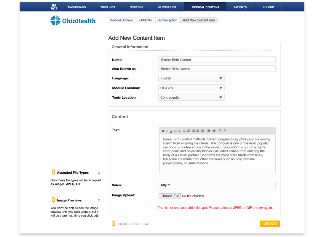
I also created a new CMS from scratch for the mobile and web applications. This was a major undertaking. It efficiently allowed data entry personnel to input production ready content while providers could easily personalize the platform to suit their needs and interact with patients with little-to-know learning curve. I provided tips on the left column of the CMS to help content creators use the system at point of use.
|
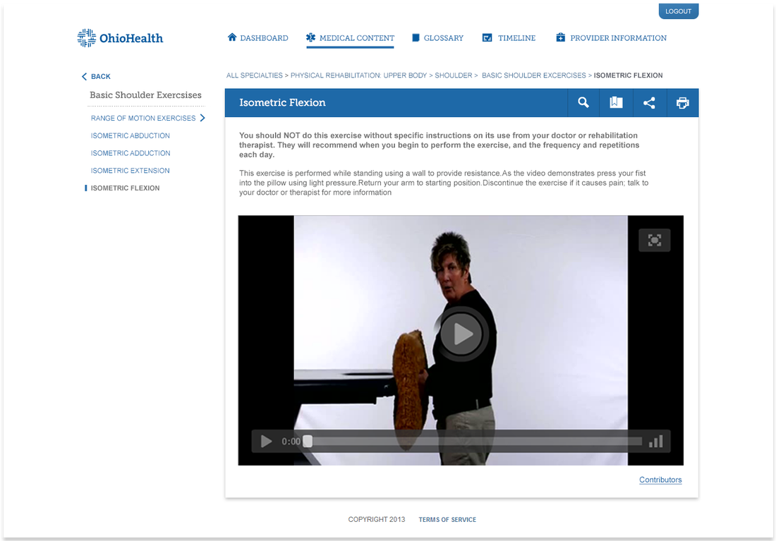
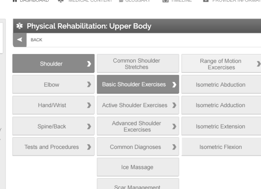
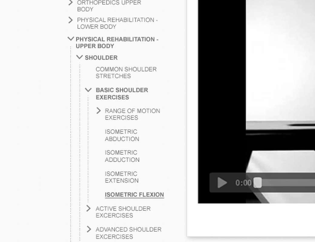
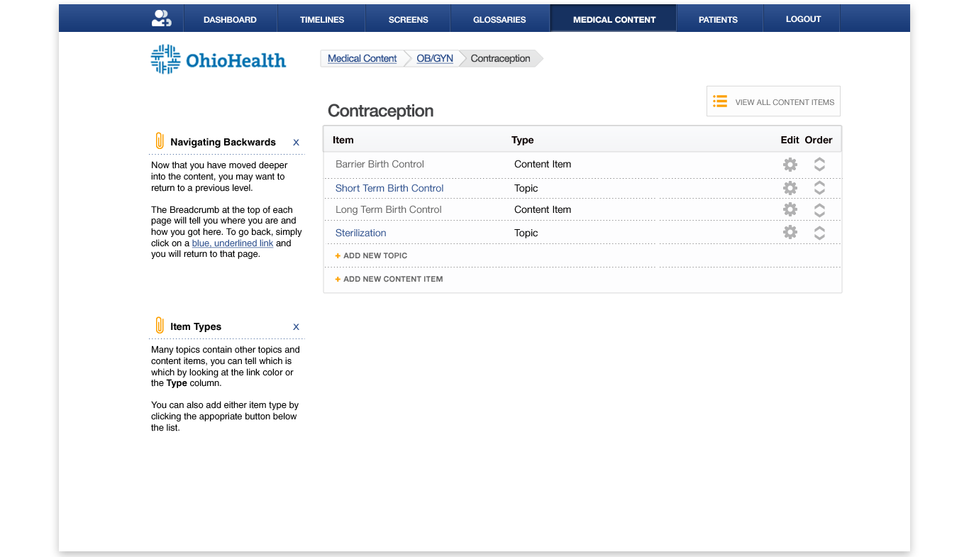
Medical ContentMedical Content is a trusted resource for patients. They can reference accurate content related to their particular ailment or browse the entire collection. I explored a number of different navigation patterns to identify one that was the most effective. There is so much content and the structure is a lot like a file system with folders and content mixed together. I differentiated between navigation links and content access points with arrows and settled on a menu that moves forward and back to show one level at a time.
|
|
Again, you can see a couple of alternative solutions I tried. The left one expands out a few limited options on click and ultimately fills the page to before taking the user to a content page. The right is a folder tree that stays visible next to the content, but both can often force content to extend down the page and require awkward scrolling behavior.
|
|
|
|
While designing the CMS, I had to make sure a user could navigate between node levels and still be able to edit the topics (think folders) and content items. So I relied on blue links to navigate to within a topic and the cog icon for editing existing topics and content items.
|
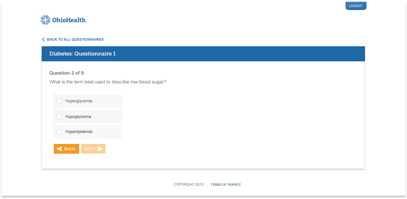
QuestionnairesDoctors can send out questionnaires to challenge patients on their recall or ask about their behavior and emotions as another method to improve their engagement and outcomes.
|
|
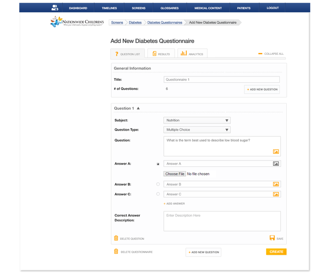
While it looks simple on the front end, the back side was a bit more complex. The author can choose from a variety of question types, add images, and even a response so that patient's can learn where they went wrong. When there are a lot of questions, each can be collapsed so that the page is easier to scroll through.
|
|
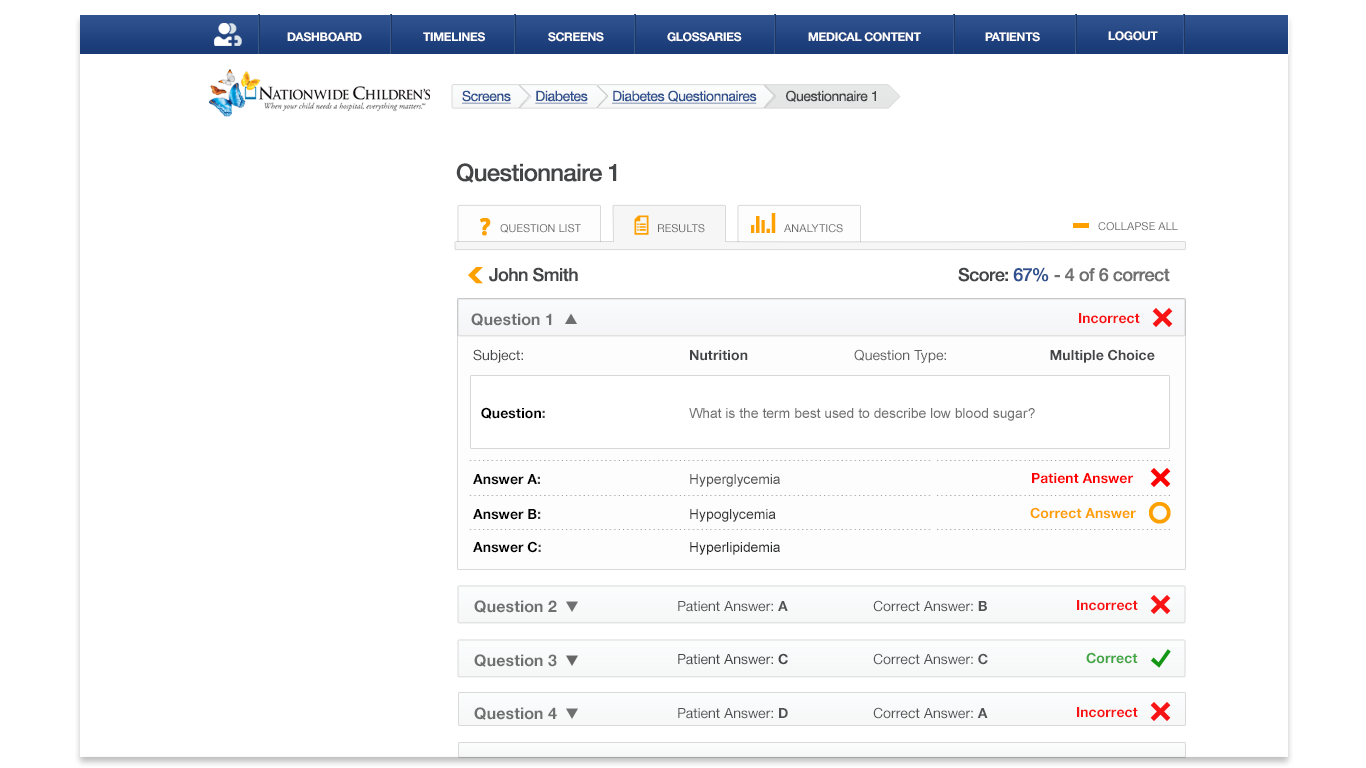
This feature is fairly robust. The health care provider can get a high level view of how well their patient population is doing and also review each patient's answer to see how well they did then dive in deeper into each question.
|
OutcomeAfter many iterations, this final designs were implemented. Overall, the platform aims to increase patient engagement and outcomes which lead to reduced readmissions while saving physicians time. The work I did on the platform helped the company to get acquired by leading healthcare technology firm, MedData which serves more than 5,000 physicians at 2,000+ hospital sites.
|
Development SupportI transformed these designs from wireframes to redlines and then continued to work closely with the developer to make sure the final product came as close to the design as possible. The wireframes helped garner support from stakeholders before development, while the redlines and style guide helped the developer bring the pixel perfect details to the final product.
|
|
|
|
|