
OHIO DEVFEST
|
CHALLENGEHow might we establish a distinct, but uniting visual identity for Ohio Devfest that can be used for all conference related media? |
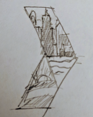
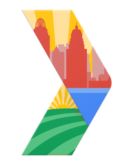
Ohio Devfest 2016My intention behind the inaugural identity, in one word, is "Unity". I tried to represent developer groups from multiple locations across the state and highlight the host city which I unified with the golden sun rays. I took some inspiration from Olympic logos.
There was a lot of meaning to pack into one identity. I could have done something vary abstract to avoid trying to say all that, but I invited the challenge. My hope was to represent this DevFest in a way that Ohio residents would immediately recognize and feel a sense of pride for it. I think there is this false stereotype of Ohio that it is a very unspecific rural state that doesn't stand out or maybe doesn't have a lot to offer. So I was excited to produce something that made a bold statement and maybe raised the bar for DevFests from more "high profile" regions. To contain all that Ohio energy, I put it inside a single bracket often used to represent coding, but also used as the symbol for GDGs. The colors are also taken from the GDG symbol and represent the Google brand in general. |
|
|

|
|
ApplicationsThe mark was used throughout the event and across mediums. It appeared on the website, social media, schedules, banners, name badges, presentations, and of course, on t-shirts. It was so well received by the team and the public that I was asked to design the identity for the following year as well. |
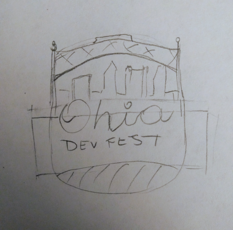
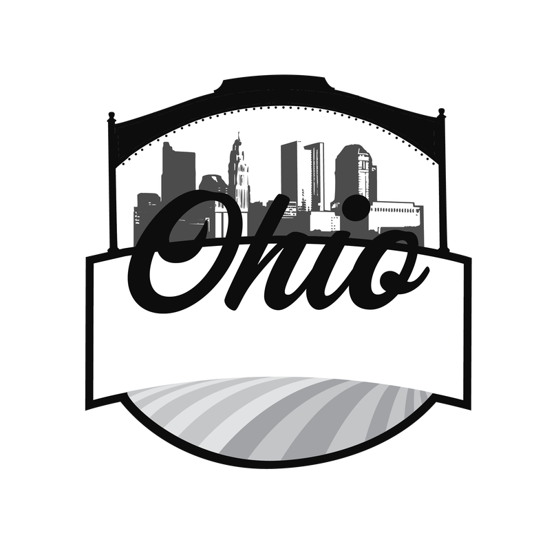
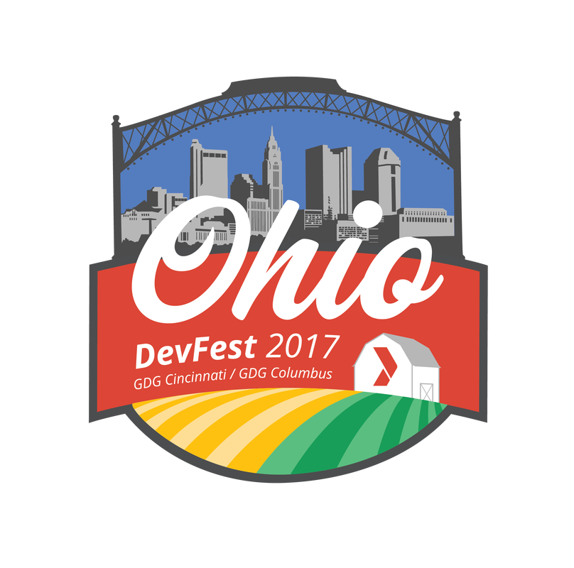
Ohio DevFest 2017As a follow up to 2016, I started to think about different strategies for annual identities as a collection. After some feedback from stakeholders, I decided to embrace different shaped emblems and maintain consistency using elements of the visual language to foster the familial relationship. Familiar elements include the typography, a city skyline, and the color scheme.
The 2017 conference was hosted in Columbus and I was inspired to push it a step further this time. Ohioans will recognize specific details like the Short North arches and the white bicentennial barn. As a slight twist, the GDG bracket symbol is in place of where"Ohio Bicentennial" ought to be painted on the side. |
|
|
|
|
ApplicationsThis mark too has been applied across mediums. Pictured here is the identity on the website homepage. In the future, I look to be more involved in the expansion of the brand as applied using elements of the logo to tell a more cohesive story to conference attendees. |
|
|
|