
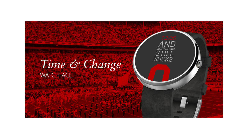
TIME & CHANGE
|
CHALLENGEHow might we learn to design or develop for emerging technologies? |
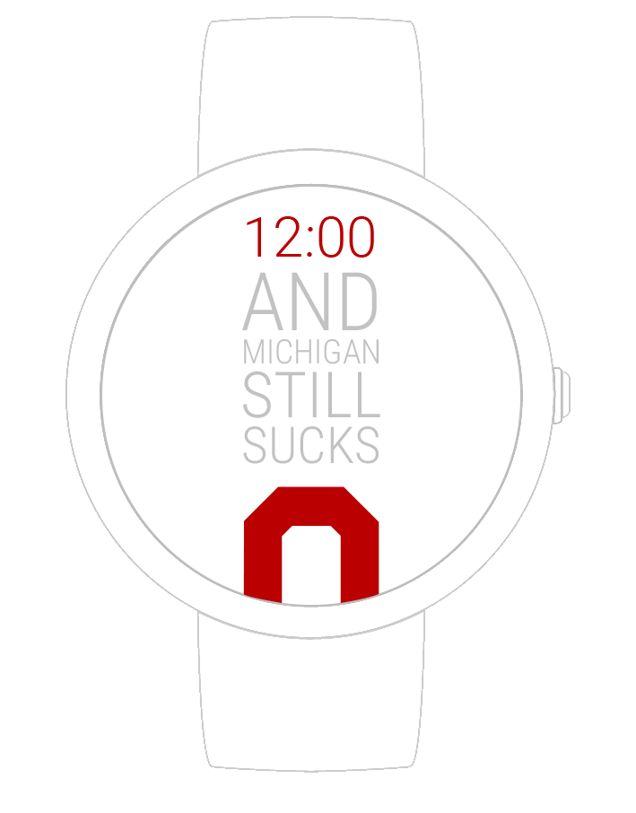
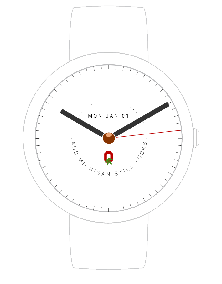
The HistoryOhio State and Michigan is arguably the best rivalry in sports. Diehard Ohio State fans have all kinds of little digs at that team up north. One in particular occurs when a person mentions the time: "Eleven O'Clock," he or she might say. Immediately, everyone in earshot will respond "...and Michigan still sucks!" So we decided it was appropriate to put that on a watch.
|
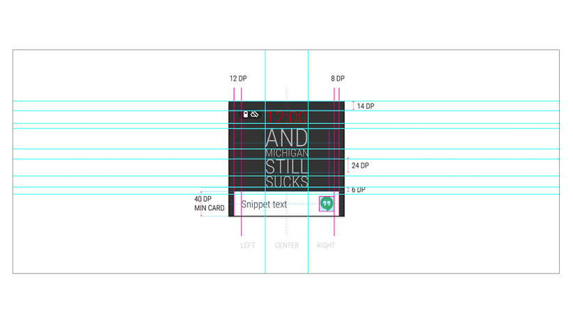
Digital & AnalogI designed two faces: one digital and one analog. The digital face relies on clean typography to create an immediate impact. It highlights the time and then draws your eye straight down and ends with a bold Ohio State "O".
The analog face is meant to provide a "classier" way to bash "that team up north". The buckeye nut in the center draws your eye in. Then I used more subtle type to radiate outward and balanced this with a functional date on top and the "O" on the bottom. |
|
|
Variations for daysI produced a wide variety of color combinations for the type and background color and designed the watch face to suite both round and square options smartwatches. That way fans can keep it fresh and still get to spend a lot of time supporting their team. |
Follow ThroughTo ensure a quality experience across touch points, I had to:
|
|
|
|